BEER LABELS ILLUSTRATED
A story about amazing craft recipes and distinctive label designs that keep selling out Pulfer’s cans.

THE BREWER.
Pulfer is a Croatian microbrewery on a mission to create a community centered around the culture of fine craft beer and creative expression.
For Pulfer, it’s about developing new brewing styles and expanding the boundaries well beyond the usual.
They love putting out fresh craft series to incite the imagination and deliver a phenomenal experience packed in a beer can.
Other than just brewing their standard beer line (IPA / Lager), Pulfer pushes their creativity by releasing 2-4 limited batches (1000-2000 L) of special-themed brews every month.
THE CHALLENGE.
When brewing, special attention is given to picking the best high-quality ingredients that compliment Pulfer’s surreal and distinctive recipes.
They understand that the beer quality and taste get the customer to come back for more, but are also aware that stand-out labels get your beer noticed and picked up from the shelf.
Having a visual system that resembles their creativity and stands out in the same way as the taste of their beer was essential to properly present their work.
In other words, they required bold and eccentric labels that reflect their brewing philosophy while stirring up curiosity about what’s inside the can.

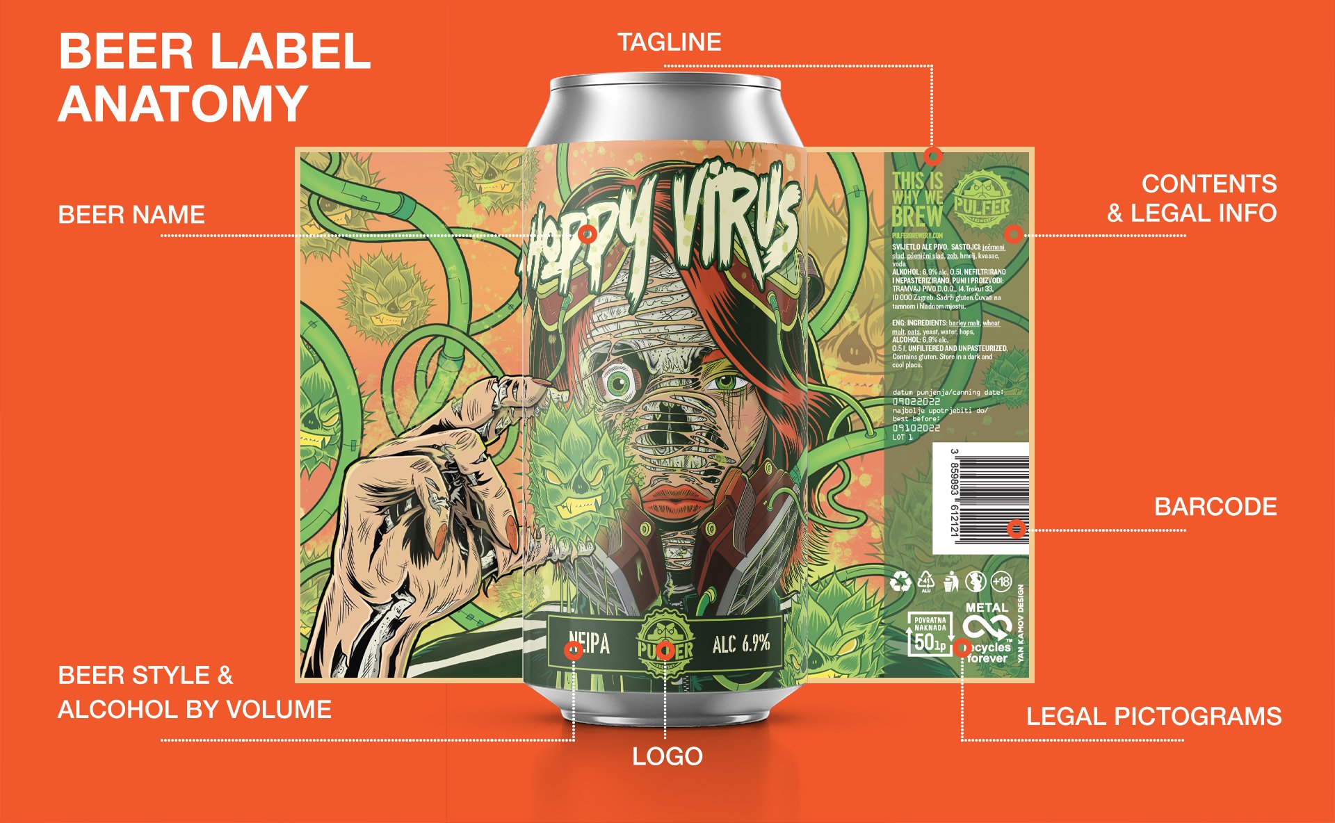
BEER LABEL DESIGN.
Everyone loves a good story. As each beer batch has a special story behind its concept and recipe, our goal was to embed it on a beer label, plus sprinkle it with Pulfer’s brand traits.
Pulfer is ferocious, curious, and daring. The labels were designed to follow suit - thick and bold lines complimented with a bright color palette forming punchy illustrations. Each beer name got a custom letterhead to round up a fierce, bold, and eccentric vibe. However creative, this process was steered by all fundamental principles of good design, while clearly communicating technical contents, legal pictograms, and the brewer’s logo.
The end result is a vivid and striking beer label, screaming at you all the way from the shelf.


ILLUSTRATED BEER LABEL SERIES.
Pulfer keeps showing off their creative side by making special themed beer series. We applied the mentioned “single label” framework to design over 30 beer labels (and counting). Since each series has its own story, it was an opportunity for us to show off our creative side, wind up our imagination, and give this brew-lore a visual representation.
Series like “Cottonballs” had a common theme of fizzy lactose IPAs, so we made up a bunch of fluffy brew monsters.
“Cybeer Punk” Triple IPA introduced a new setting called Hop City - an imagined place in a distant future that’s packed with drama, villains, and other characters with intense backstories. To add more value to this crazy brew story, we drew a short comic.
This synergic approach to brewing and designing labels helped foster creativity while building up brand recognition and emphasizing what Pulfer is all about.
T


MERCH DESIGN.
Whatever your business is about, well-designed merch is an avenue for brand recognition. As designers and individuals, we love working with companies and people who are genuinely passionate about what they do.
Since working with Pulfer was an absolute delight, we went a little overboard and designed a bunch of merch that got bundled up with their new beer series.

We started designing labels for Pulfer back in the fall of 2021. Since then, the brewery made over 40 new batches of beer and showcased its work at craft beer festivals all over the EU. Currently, they’re planning a new collaboration for the Dutch market starting in 2023.
So far, they’ve sold the sh*t out of every beer can and are continuing to grow. Many new wacky beers are in the making, stay in the loop by following Pulfer on social media.
